
How to control color discrepancy of paper boxes?
What is color discrepancy?
Difference between designed colors and final printed results or each batch of products. Such as hue variations or saturation differences.
Can color discrepancy be 100% avoided in custom boxes?
100% impossible! But below are 5 Color Discrepancy Solutions for paper boxes:
- Same materials /ink batch
- Same printing machines & crew
- Same finishing (lamination/coating)
- Identical inspection tools + standards
- Smart color choices (e.g., black + embossed logo)

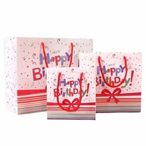
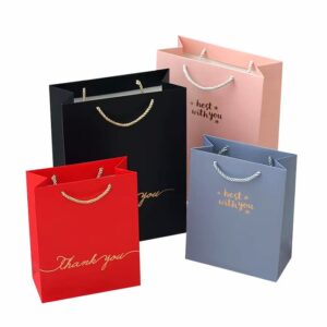
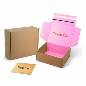

- Double-Sided Coated Paper: Offers superior color stability because uniform ink absorption on both sides. Minimize color shifts in printed paper boxes—ideal for high-graphic designs.
- Single-Sided Coated Paper: Color stability is lower on the uncoated side, leading to potential discrepancies in printed paper boxes requiring double-sided visibility.
- White Kraft Paper: It is eco friendly but its bumpy surface may make colors look slightly different. For steady color in customized paper boxes, always use matte varnishing.
- Wood Free Paper: Provides consistent whiteness and smoothness. It reduces color deviation in custom boxes with logo for luxury packaging like rigid gift boxes christmas.
- Grey Cardboard Paper: Single-sided coating limits stability. Requires UV/matte finishes to counter yellow undertones and humidity sensitivity (ΔE≤2.5) for budget booklet box.
- Special Art Papers (e.g., textured/foiled): High risk on color shifts. For steady colors, use Pantone inks and UV finish for magnetic gift boxes wholesale.
Common colors and printing types
1. Color Systems for Paper Boxes
CMYK: Use CMYK for colorful designs. Ideal for art paper and coated paper because of smooth surfaces that retain ink detail.
Pantone colors: Matches brand-specific colors (e.g., logos) with precision. Best for kraft paper and cardboard, where color consistency is critical.
Special Inks: Metallic gold/silver. Or hot stamping or screen printing, often on luxury rigid boxes or textured paper boxes.
2. Common Printing Techniques
Offset Printing on Coated paper, art board for High-detail cosmetic packaging boxes.
Flexographic on Corrugated cardboard for kraft for Shipping boxes, eco-mailers. Fast drying, cost-effective for bulk.
Silk Screen on Rigid boards and leather art paper for luxury watch boxes, box jewelry boxes. Thick ink layers and tactile effects.
Digital Printing on Light weight papers (≤300gsm) for Small-batch custom boxes with logo. No plates needed and quick turnaround.
3. Surface Finishes
Lamination Gloss/Matte: Adds durability and shine. Used on coated paper for cosmetics or white cardstock for luxury goods.
Spot UV: Creates glossy contrasts on matte laminated surfaces. Ideal for highlighting logos on gift boxes for presents.
Embossing / Debossing: Works best on thick paper (e.g., 400gsm) for premium packaging.
Hot Foil: Applies metallic gold, silver on logos. Requires smooth art paper or kraft paper for adhesion.
Which printing is suitable?
- UV printing keeps colors super steady. UV lamps dry inks fast, locking colors perfectly onto printed paper boxes. This prevents fading.
- Hot foil stamping gives almost no color change on custom boxes with logo. Why? The foil colors are in stock to choose.
- Spot UV adds a glossy shield over ink. It prevents sun/air damage, so colors stay truer for longer on your boxes.
- Flexo printing gives pretty steady colors on printed paper boxes, especially with Pantone colors. But since inks soak into paper, tiny color shifts might happen.
- Offset printing gives steady color in custom gift boxes. It perfectly balances ink and water while matching colors exactly.
Color Discrepancy Solutions for Paper Boxes
Color discrepancy is the visible gap between the color you approved on screen or in a sample and the color that actually lands on your paper box—whether across a single run or, more damagingly, from one production batch to the next. It shows up as shifts in hue, changes in saturation, or subtle tonal drift that a customer can spot the moment two units sit side by side. On a retail shelf or an unboxing video, that inconsistency reads as a quality problem even when the box is structurally perfect. The first thing every buyer should understand is that zero variance is not physically achievable: paper is an absorbent, slightly variable substrate, ink reacts to heat and humidity, and every press has its own fingerprint. What is achievable—and what separates a reliable supplier from a risky one—is tightening the variables until the difference falls inside a tolerance nobody notices. That is the entire job of a color-control program.
The single biggest lever is the substrate itself. Double-sided coated paper absorbs ink evenly on both faces, so it holds graphics with the least drift and is the safe choice for high-color-coverage designs. Single-sided coated stock is stable on its coated face but can wander on the raw side, which matters only when both surfaces are visible. White kraft is genuinely eco-friendly, yet its fibrous, bumpy surface scatters light and makes flat colors look marginally off—counter that by specifying matte varnishing rather than gloss. Grey cardboard and corrugated grades need UV or matte finishes to suppress yellow undertones and humidity creep (target ΔE ≤ 2.5). On the color-model side, CMYK is right for colorful art on smooth coated sheets, while Pantone (PMS) is the tool for brand-specific spot colors—logos especially—where kraft and cardboard demand precision. Metallic gold or silver, hot stamping, and screen printing sit in the “special inks” tier and belong on luxury rigid or textured boxes where a tactile finish matters more than perfect registration.
Once the material is locked, consistency is won on the production floor. Run every repeat order on the same printing press inside one factory, with the same ink brand and the same operator, because machine and human fingerprints are the quiet cause of “why does my reorder look different.” Set a measurable acceptance window—ΔE < 2 with a visual sign-off—and judge every batch under one controlled light source so you are not comparing a proof under office LEDs to a box under warehouse fluorescents. Physical hard proofs made before the full run catch problems that a monitor never will; ICC profiles and weekly calibration of printers and monitors keep the digital-to-physical conversion honest. UV printing locks color almost instantly and resists fading, hot foil barely moves because the foil color is a fixed stock, and offset earns its reputation by balancing ink and water to match the target exactly—flexo is steady with Pantone but lets a little ink soak in, so expect a hair of shift.
None of this trades away sustainability. White kraft and corrugated remain the greenest routes—no lamination, no magnets, fully recyclable—and for eco-focused programs we supply FSC-ready paper so the environmental brief and the color brief are met together. The practical takeaway is simple: treat color as a managed process, not a hope. Freeze your substrate, your color system, and your finish; seal a golden sample as the reference; and share that spec with both your ink and paper suppliers so every link in the chain is aiming at the same number. If you want to see how a specific paper behaves with your artwork before committing to volume, request a free customized sample and we will proof it under production conditions.
20 methods to minimize color discrepancies of printed gift boxes
- Use identical reference samples and production batches for boxes cardboard boxes to eliminate batch-to-batch variations.
- Produce all custom boxes with logo on the same printing press within one factory to avoid machine-specific deviations.
- Use the same person for all customized gift box jobs = steady work.
- Stick to same ink brand + mix to avoid color surprises.
- Keep same heat/moisture levels to keep ink steady.
- Ensure uniform substrate whiteness (e.g., paper grade) across all booklet box batches.
- Apply identical finishing treatments (e.g., gloss/matte lamination, foil stamping) to avoid surface-effect variations.
- Set ΔE thresholds (e.g., ΔE<2) for measurable tolerance and visual approval for customized paper gift boxes acceptance.
- Always check colors under the same controlled light.
- Stick with the same tools and trained team for trustworthy custom branded boxes checks.
- Implement Pantone Matching System (PMS) for custom gift boxes to ensure spot-color accuracy and brand consistency.
- Apply ICC profiles to standardize color conversion across devices for customized paper packaging boxes.
- Calibrate printers/monitors weekly to maintain device accuracy for luxury paper boxes design and proofing.
- Test samples first to see how ink works with your paper before making custom vape boxes.
- Validate colors via physical hard proofs pre-verify print outcomes.
- Optimize print pressure settings to ensure uniform ink layering on gift boxes christmas.
- Always clean rollers and plates to stop ink messes during custom paper box runs.
- Control water mix in offset printing to stop ink problems on wholesale boxes.
- Build a Pantone/library database for quick color retrieval in brand paper boxes work flows.
- Share color standards with ink/paper suppliers to align material properties.
-
1. What is color discrepancy in custom paper boxes?
Color discrepancy is the gap between your designed colors and the final printed result—or between production batches. It shows as hue or saturation variations on the box surface. Common in custom paper boxes, it affects brand consistency and shelf appeal. Understanding this difference is the first step to controlling it across materials, inks, and printing methods.
-
2. Can color discrepancy be 100% avoided in custom boxes?
No, 100% avoidance is impossible. You can minimize it with five controls: use the same materials and ink batch; run the same printing machines and crew; keep the same finishing like lamination or coating; inspect with identical tools and standards; and make smart color choices such as black with an embossed logo. These steps tighten consistency in your custom packaging.
-
3. CMYK or Pantone — which color system should I specify?
Use CMYK for colorful designs on art or coated paper. Specify Pantone (PMS) for brand-specific colors like logos, where precision matters—best on kraft and cardboard where consistency is critical. Special inks such as metallic gold or silver, hot stamping, and screen printing suit luxury rigid or textured boxes. Match the system to your custom packaging and brand needs.
-
4. Are eco-friendly kraft boxes available with stable color, and what about FSC?
Yes. White kraft is eco-friendly but has a bumpy surface; use matte varnishing for steady color. For eco-focused orders we offer FSC-ready paper and can match materials to your market's compliance needs. All our paper boxes are recyclable. Choose kraft or cardboard when sustainability matters without sacrificing batch-to-batch color control.
-
5. Which printing method keeps box colors most consistent?
UV printing locks color fast and prevents fading. Hot foil stamping changes almost not at all since foil colors stay in stock. Spot UV adds a glossy shield against sun and air. Flexo stays steady with Pantone, though inks can soak and shift slightly. Offset balances ink and water to match exactly. Choose the method by your substrate and volume.
-
6. How do I keep reorder / batch-to-batch color consistent?
Hold color with PMS spot colors for brand consistency, use the same press, ink brand, and crew in one factory, and set ΔE<2 thresholds with visual approval. Validate via physical hard proofs before production, and test samples first. Share color standards with your ink and paper suppliers. These proofing steps keep your custom packaging steady across reorders and batches.

ALLEN LEE
Hi, I’m Allen Lee, the owner of Allenboxes.com, I’ve been in the packaging industry for over 20 years and running a factory in China that produce for 10+ years, and the purpose of this article is to share with you the knowledge related to packaging from a Chinese supplier’s perspective.
Why Your Quote Jumped After the Factory Reviewed Your Artwork
Your quote can jump after artwork review. Learn how bleed, spot colour, foil and die-cuts change price, and how to lock a file-reviewed quote before approval.
Stopping Production After You Spot an Error
Stop production after error found using a confirmation gate. Learn who pays, how to issue a stop order, and how to cap loss before the entire run prints.
Why Your Reorder Looks Different From Your First Batch
A reorder different from first batch traces to paper, ink and machine drift between runs. Sealed golden samples and frozen specs keep repeat orders consistent.
Custom Bubble Mailers: Poly Padded Shipping Guide (2026)
Source custom bubble mailers in bulk: poly padded shipping bags with bubble bonding, self-seal strips, opacity and a buyer QC checklist for shipping.
Why One Box Has Three Different MOQs (Print, Structure, Finish) (2026)
See why one box shows three different MOQs for print, structure and finish. Learn to read process-level minimums and plan your true reorder quantity.
Christmas Mailer Boxes for Ecommerce: Tear-Strip, Branded Unboxing & Protection (2026)
Source Christmas mailer boxes for ecommerce in bulk: tear-strip opening, branded unboxing, protective inserts, MOQ tips for holiday subscription shipments.